We hardly pay heed to the meaning of logos of the brands we see daily. Every brand has a story, in this post, we will look into the meaning of logos of few brands, what was the logic behind their creation and also false myth associated with the meaning of the logos.

https://i1.wp.com/www.callcentrenumbers.co.uk/wp-content/uploads/2013/12/ap2.jpg
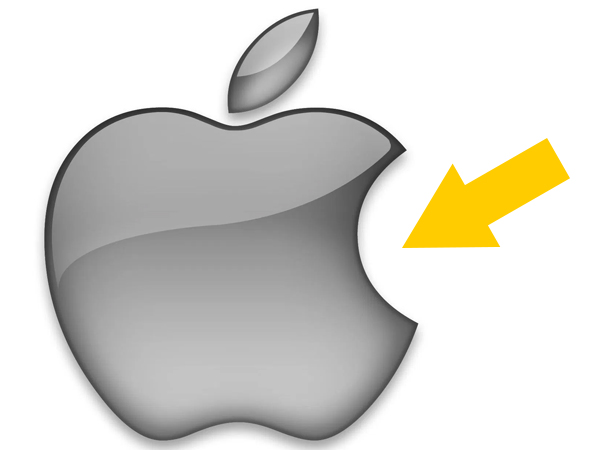
The general theory has been that Apple logo was dedicated to Allen who ended his life by eating a poisoned apple. Well, truth is a designer named Rob says; he made the Apple show the dimensions in the shape as bitten from the right side so the Apple can easily be figured out and not confused with any other fruit shape.
http://www.carlogos.org/logo/Ferrari-emblem-1920×1080.png
https://en.wikipedia.org/wiki/Francesco_Baracca#/media/File:FBaracca_1.jpg
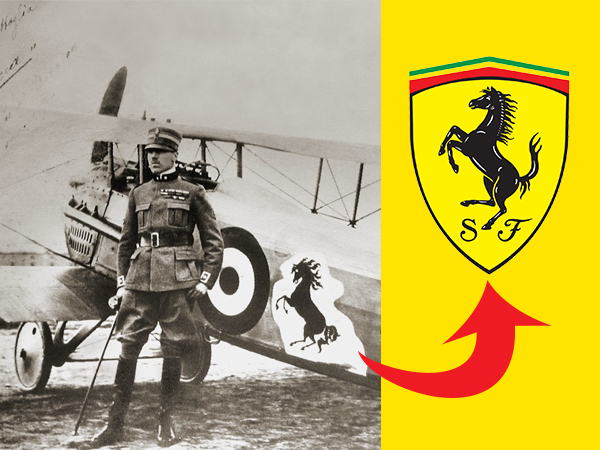
The general misconception is, Ferrari logo points out to horsepower but that is not correct. The horse symbol was gifted to Enzo by a friend’s mother after his victory in a race.
https://upload.wikimedia.org/wikipedia/en/thumb/8/80/Wikipedia-logo-v2.svg/1200px-Wikipedia-logo-v2.svg.png
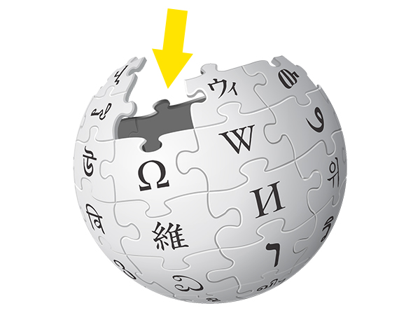
Wikipedia logo resembles earth and each puzzle symbolizes a different language. The missing puzzle piece means encyclopedia is still not finished and being continuously compiled.

http://www.clker.com/cliparts/4/y/j/v/E/G/restroom-hi.png
https://image.freepik.com/free-vector/android-boot-logo_634639.jpg
It’s funny but the inspiration did come from the symbols we usually see on the doors of public Washrooms.
http://cdn2.insidermonkey.com/blog/wp-content/uploads/2014/12/MCD_JapanFries.png
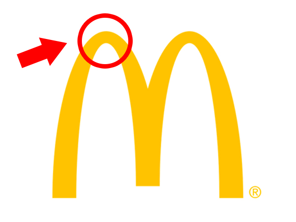
In 1962, a psychologist named Louis Cheskin was hired by McDonald who suggested replacing the the Cook logo with golden arches making an “M.”. He suggested that such a shape resembles female breasts. Weird, ehh!
https://pixabay.com/p-5885/?no_redirect
http://www.carlogos.org/logo/BMW-logo-2000-2048×2048.png
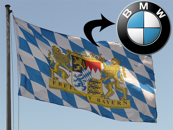
We all thought BMW logo refers to an airplane propeller, but in reality the blue and white were chosen to represent the colors of Bavaria.
http://www.jilleysue.com/wp-content/uploads/2013/09/635946503189638341-239880403_pinterest.jpg
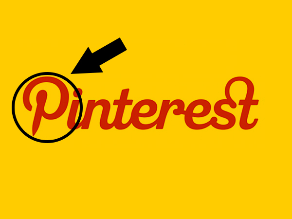
Seems simple right?. Take a close look at the first letter, it resembles a pin.
http://1000logos.net/wp-content/uploads/2017/05/Pepsi-Logo.png
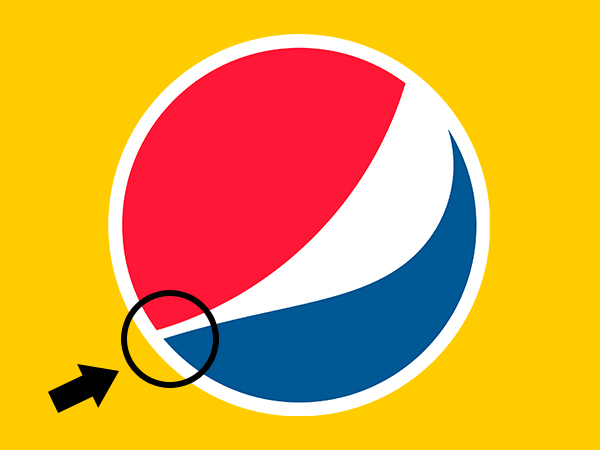
Costed more than one could even imagine. This $1 million.logo defines the proportions of the golden ratio that are pleasant for the human eye
https://i.imgur.com/8OqFr0r.jpg
https://kottke.org/plus/misc/images/lion-cat-scan.jpg
https://pmcvariety.files.wordpress.com/2013/06/mgm-logo.jpg?w=670&h=377&crop=1
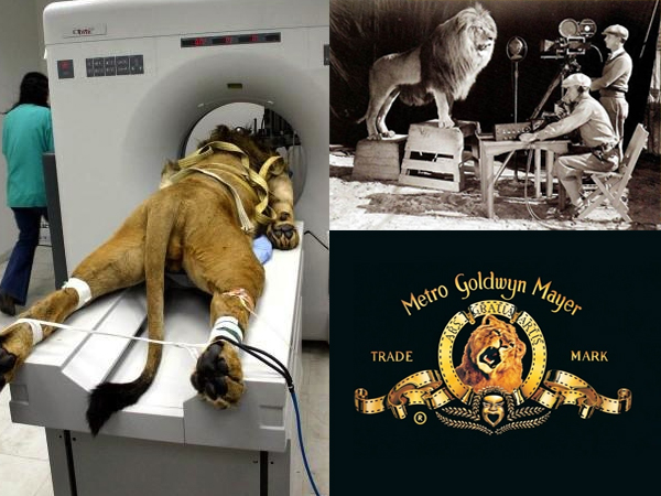
We have seen trending posts on social media about the story of this logo but that is a hoax. The picture on the left is of a lion undergoing a MRI. Few know that there have actually been 7 different lions used for this purpose, trained to roar on a cue.
The post originally appeared on BrightSide