
Many jumped with Joy when they got the notification to switch to the new user interface design of Facebook. For many, this new design completely caught them by surprise. This is not the first time Facebook has changed its user interface.
Facebook has been doing massive changes in its design ever since 2008 but this time around, they’ve cleaned everything under the carpet that has orchestrated a way to completely new design and no one knows what’s the design philosophy behind this new user interface.

Regardless of the fact that Facebook wants to move forward with the same pace as other social networking websites are, regardless there is a nicely presented dark mode that’s so pleasant to the eye, regardless of the fact that there must have been numerous hours, unlimited testing done on the new design before it is introduced to the public and rolled out gradually to accounts all over the world, the truth remains — the expectation of the public is not met.
Somehow, Facebook is aware of people’s expectations, therefore the company has provided a way to roll back to the old design in case someone is not adaptive to a chance. The new design is not user friendly, it has bugs, to say the least, and many functionalities which were present in the old design are taken away for a strange reason in the new design.
People with a good following can not see from a profile if a person is following them. Previously, it used to state “follows you”. This does not happen anymore.
Even though the majority of new profiles have been given a new design, there are still profiles with an old design and when you click on the notification, sometimes you get a strange notification such as “this page is not designed for new interface” or sometimes even more weird message such as;
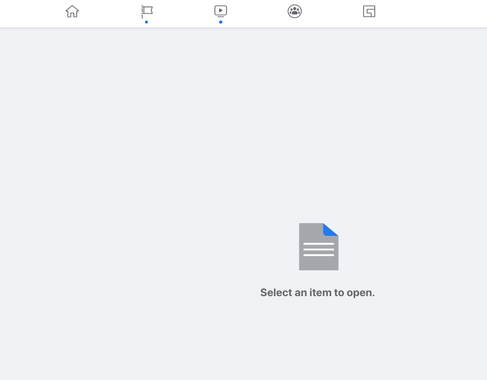
Dear Facebook, what kind of item do you want me to select and open?. I simply clicked on a notification.
Well, that’s just the tip of the iceberg. There’s a lot more to the bug list. It seems like not only the design is changed but also coding too. Many users have noticed that their timeline, especially when they click on their profile to see their own posts fetches old posts instead of recent posts. You have to manually refresh your browser to see the updated timeline.
It’s true that this new Facebook design turns your PC into an enormous phone with one central timeline scrollable but as you continue to scroll down to posts beyond a day, you begin to see the effect of slowness, heaviness on your browser which shows that the new design is perhaps created keeping in mind people with high internet, fast PC.
Your personal timeline over the years is gone. I have no idea why would Facebook do it. Previously, you could see your Timestamp by clicking on your personal timeline and could select activities of different years. You could do this to see your own yearly time stamp as well as other users’ time stamp.
I would stop here.
If you want to switch back to the old design, you can do that by clicking in a down arrow on the top right of your Facebook account. There, you will see an option but behold — this is limited time privilege only. Down the road, you will have to live with the new design and hope Facebook gets its design problems sorted out.