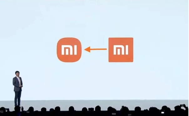
Xiaomi is under fire by the critics for the redesign of the company logo and people are creating memes and jokes about it on social media. The Chinese smartphone company has spent 3 years and thousands of dollars. Xiaomi’s new logo is astonishingly similar to the one company is using since its birth in 2010.
The new logo, which is a “squircle” shape was revealed at the launching ceremony of the company’s plan for electric cars, which was rumored a long time ago, and the folding smartphones.

The new logo has no sharp edges and they are replaced with rounded lines. CEO of the company Lei Jun said the new logo will represent the new image of the company.
Xiaomi was looking for a new design for the logo since 2017. The director of art of Japanese company Muji, a well-renowned designer Kenya Hara was selected for this job. “Finally, a design moved us,” Lei said. The estimated cost of the new logo 2 million yuan (US$305,000). The price is not confirmed by the company yet. The new logo and the time it took to be finalized were criticized the most.
“I think Boss Lei got scammed,” Weibo user comment which gets around 4,000 likes. “I suggest that Xiaomi call the police.”
“I can do this for 20,000 yuan,” . “Or 2,000.” Few more comments from the Weibo user under the new logo post of the company. Xiaomi didn’t respond to the comments.
Xiaomi is China’s biggest company of smartphone. It surpassed Huawei Technology Co in the fourth quarter because of the sanctions imposed by the US on telecom equipment. Now the Xiaomi is on top after 2016 when the other giants like Huawei, Vivo, and Oppo toppled it. was
Even this top position doesn’t make this company adorable because of the patriotic sentiment attached to Huawei in the times of US-China teach war.
Lei said that people might not get the idea of the new design at first. “Are you disappointed at this logo, that we just made our original logo rounder?” he asked.
Lei wrote an article on its official WeChat account. “I suppose many people would say, ‘That’s it? That took three years?’”. Lei acknowledge the new design and consider it the true depiction of the company’s “internal spirit and qualities”.
Kenya Hara’s 5-minute explanatory video was played at the event. He said he come up with a new shape combining the two shapes circle and square after comprehensively studying the shapes and applying mathematical equations. It is the perfect balance between the two shapes and the typography “mi” was changed according to the curves used in the design.
Lei told the audience that point which moved him by the Hara’s explanation was that the logo “thinking from Eastern philosophy”.
Many people think the story behind the logo is more important. Some say hiring Hara for the job was the buzzword and made it the headlines on the internet. The actual design is not important; the important thing is this revelation of the new logo has brought more attention to Xiaomi through viral discussions all around the world.


