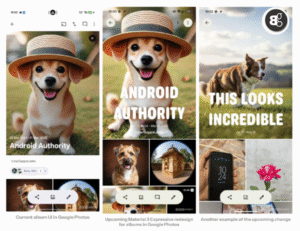
Google Photos might soon feel a little different the next time you open it. A recent discovery inside the app’s code suggests Google is working on a new look for album covers, and it’s a shift that feels much more eye catching than before.
Instead of the small titles tucked into the corner, album names will now appear front and center in large, bold text. The redesign takes on a “Magazine style” approach, making each album cover stand out as more than just a thumbnail of pictures. The change lines up with Google’s Material 3 Expressive design guidelines, which aim to make apps cleaner and more visually engaging.

One interesting experiment, still hidden in the code, is dynamic text wrapping. This would allow titles to bend and flow around objects in a cover photo, blending text and image into a more seamless design. It’s not active yet, but it shows Google is thinking beyond simple labels.
Read More: Google’s Legal Victory Secures Apple’s $20B Search Deal
Alongside the new covers, the app’s interface is also being shuffled. The album image now stretches to the top of the screen, while some familiar buttons have been moved. For example, the cast button is now hidden under the three dot menu, and the comments button has shifted to the bottom pill alongside sharing and editing. The sort button, however, seems to have disappeared entirely you’ll need to enter edit mode to rearrange photos.
These changes aren’t live yet and could still evolve before release. But given how closely they follow Google’s design playbook, it’s safe to expect that users will see this fresh look soon. For those who rely on Google Photos to store memories, the update promises a cleaner interface and covers that feel more personal and polished.


