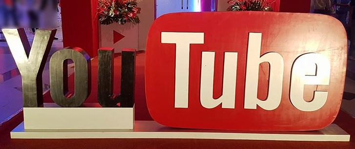
YouTube has a completely new design now along with a new logo to accompany it. In twelve years, this is the first time the company has brought a change to its appearance. The tube-in-a-tube design has been taken has been taken away and the red blob covering the second half of the YouTube has been removed. Now, the red colored play button is situated to the left of the word mark which used to serve the app’s icon as well as visual identifier in ads.
The word mark looks a bit plain now without the red blob but the platform says that the change has been inspired by magnitude of devices and the new logo is more adaptable for different screen sizes. The announcement states that the revamped YouTube Logo and YouTube Icon are represented by the bright red cherry on the top of the update. This change has been made for serving the multi-screen world. The updated logo creates a more flexible design for improving its working across numerous devices including the smallest screens.
This new design was being tested by the platform for months and opened it up in May. The new look is cleaner but the ample use of whiteness may be a dark mode for the users who are not comfortable with an eye surrounding whiteness. For mobile and desktop devices, the new update has been rolled out and will be brought to other services soon.
Via: TNW


