Apple isn’t just about iPhones, Macs, or iPads it’s a brand that has shaped culture. At the heart of its identity lies a logo so simple, yet so powerful, that it’s instantly recognized around the globe. But it wasn’t always that way. The Apple logo has gone through bold transformations since 1976, and each version reflects a chapter in the company’s story.
Why the Current Apple Logo Works
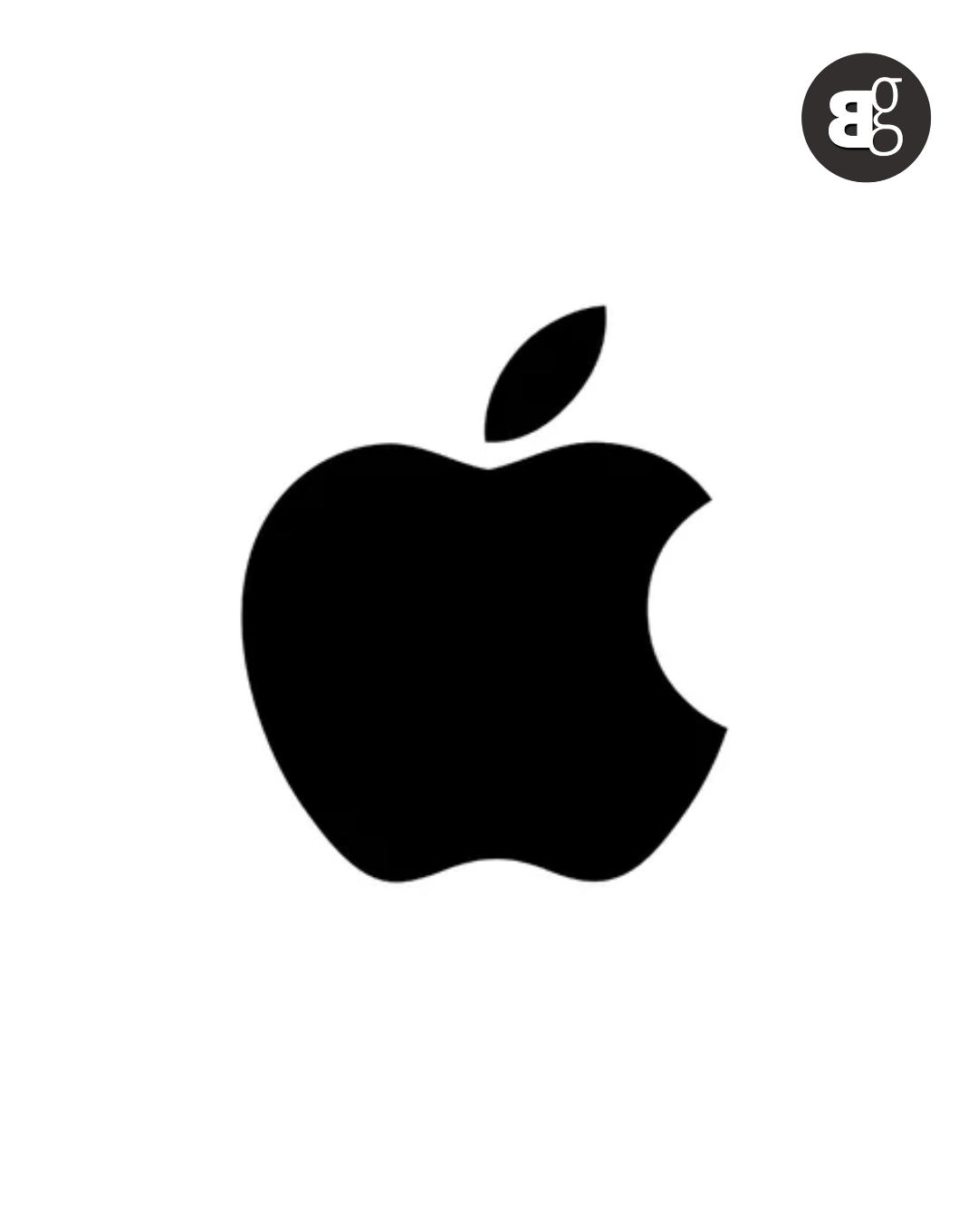
Today’s Apple logo is sleek, monochrome, and minimal. It works because it perfectly matches the brand’s philosophy: simplicity, elegance, and innovation. Unlike busy designs, this logo doesn’t fight for attention it commands it. Whether glowing on a MacBook lid or stamped on AirPods, the clean bite marked apple feels timeless, premium, and trustworthy.

Read More: Facebook Announces Removal of Community Chats for Groups
Evolution of the Apple Logo (1976, 1977, 1984, 1998, 2001, 2007, 2017)
-
1976 – Newton under the apple tree, an artistic but overly complicated design.
-
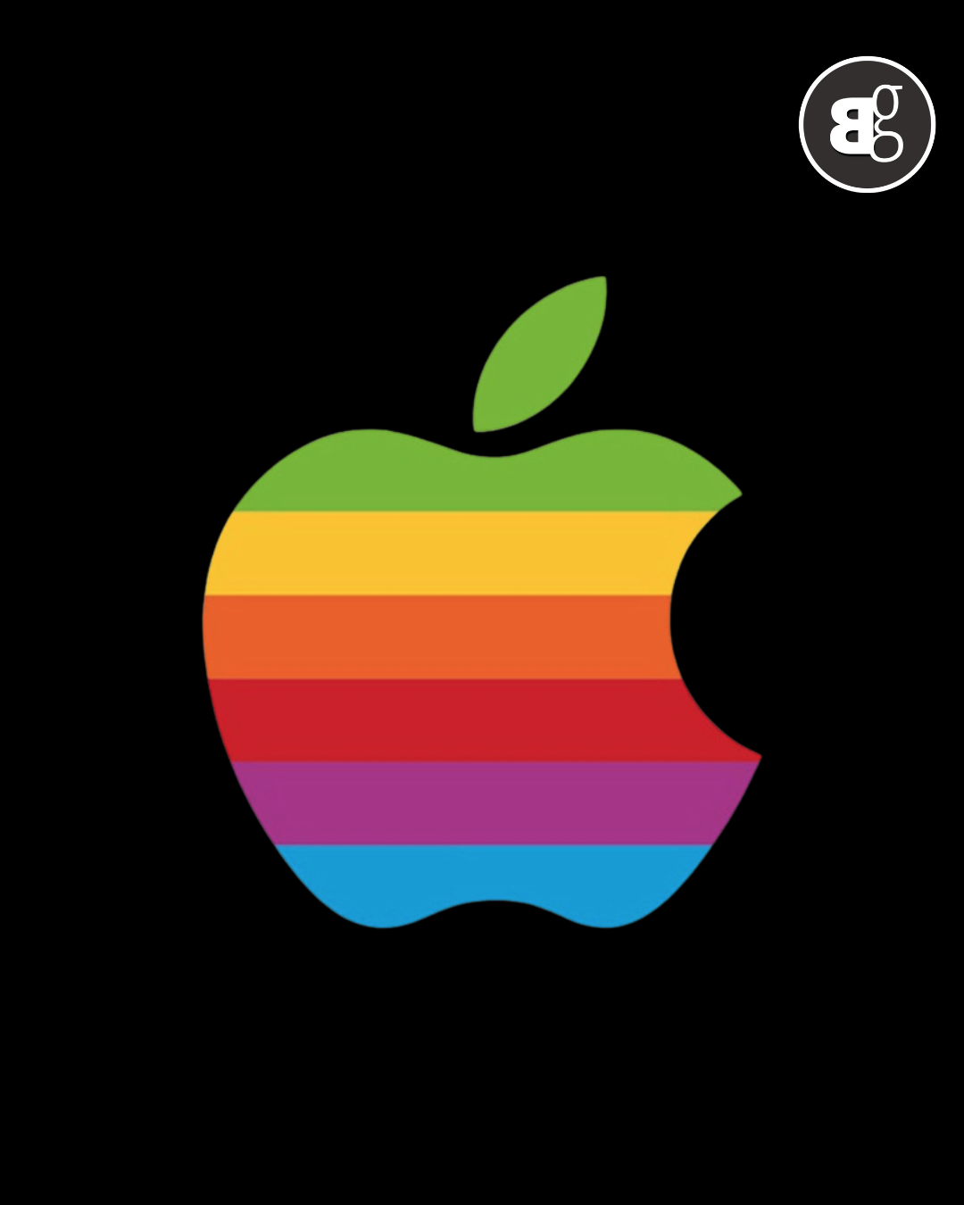
1977 – The rainbow-striped bitten apple arrives, symbolizing creativity and diversity.
-
1984 – The rainbow stayed, but the logo grew more polished as the Macintosh launched.
-
1998 – A bold shift to a single color monochrome apple during Apple’s rebirth with the iMac.
-
2001 – The logo turned glossy, reflecting the futuristic vibe of the iPod era.
-
2007 – With the iPhone launch, the logo slimmed down into a glass like, modern look.
-
2017 – Flat and simple again, matching the trend of minimalism in digital design.
See More: iPhone 17 Pro/Max vs iPhone 16 Pro/Max: Full Comparison Guide
Each version carried Apple through different milestones, and together, they shaped one of the strongest brand identities in history.
Apple logo is more than just a design it’s a reflection of the company’s story. Each version marks a turning point in Apple’s history, showing how the brand grew from a struggling startup in a garage to one of the most valuable companies on earth. Let’s walk through the journey.
1976 The Newton Sketch
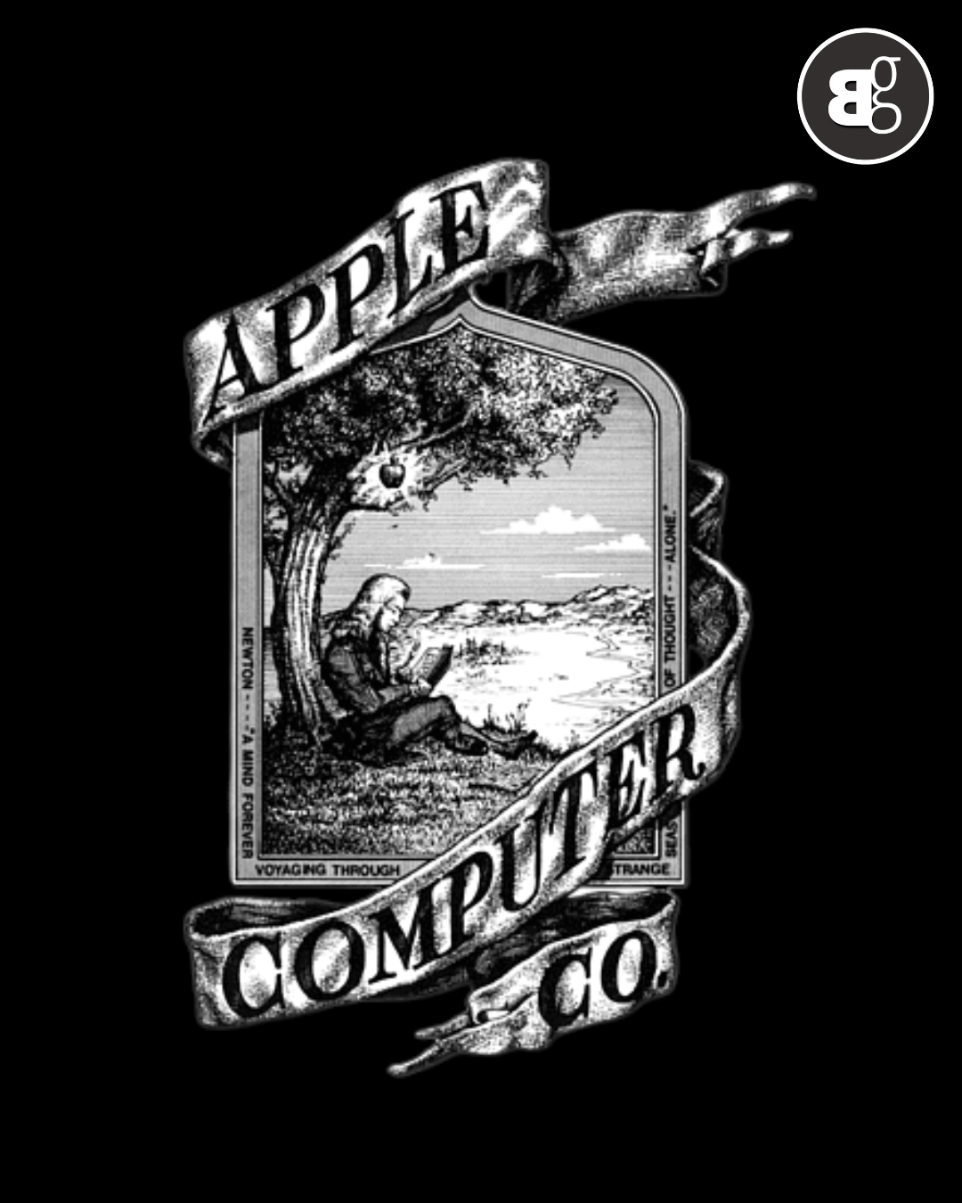
The very first Apple logo, drawn by Ronald Wayne, was nothing like what we know today. It showed Isaac Newton sitting under a tree, with an apple about to fall on his head. It looked more like an illustration from an old book than a company logo. Beautiful? Yes. Practical? Not at all. It was far too complicated to put on products, and within a year, it was gone.
1977 The Rainbow Apple
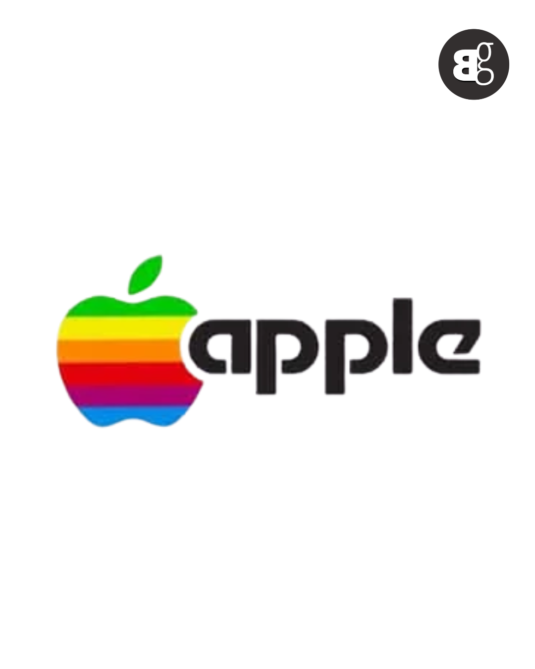
This is where things really started. Steve Jobs wanted something simple, modern, and bold. Designer Rob Janoff came up with the bitten apple, filled with rainbow stripes. That “bite” wasn’t just clever wordplay on “Byte,” it also made sure people didn’t mistake it for a cherry. The colorful design represented creativity and Apple’s groundbreaking ability to display colors on computers a big deal back then.
1984 The Macintosh Era
By the time the Macintosh launched in 1984, the rainbow apple had already become iconic. It wasn’t just a logo anymore it was a symbol of thinking differently. Apple positioned itself as the fun, creative rebel in a world dominated by serious, corporate looking computers.
1998 The Comeback
When Steve Jobs returned to a struggling Apple, one of the first things he did was refresh the logo. Out went the rainbow, and in came a sleek monochrome look. This lined up perfectly with the launch of the iMac, a product that brought Apple back from the edge of collapse. The new logo said one thing loud and clear: Apple was modern, stylish, and here to stay.
2001 The Shiny 3D Look
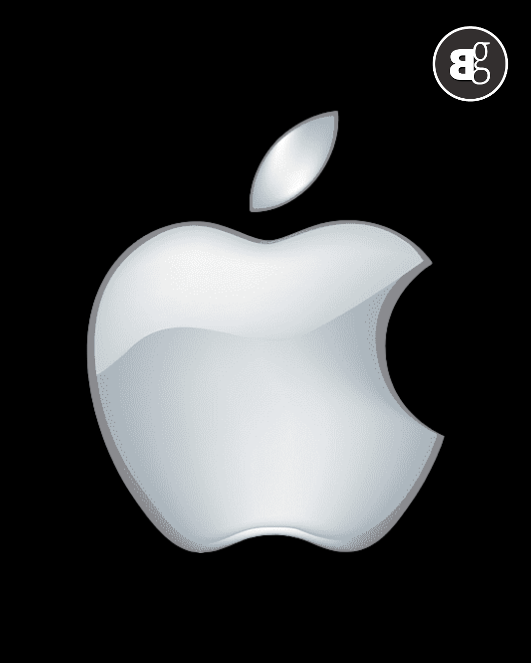
The early 2000s were Apple’s comeback years. With the iPod changing how people listened to music, Apple gave its logo a glossy, glass like finish. It felt futuristic, techy, and fresh just like the products Apple was putting out.
2007 The iPhone Shift
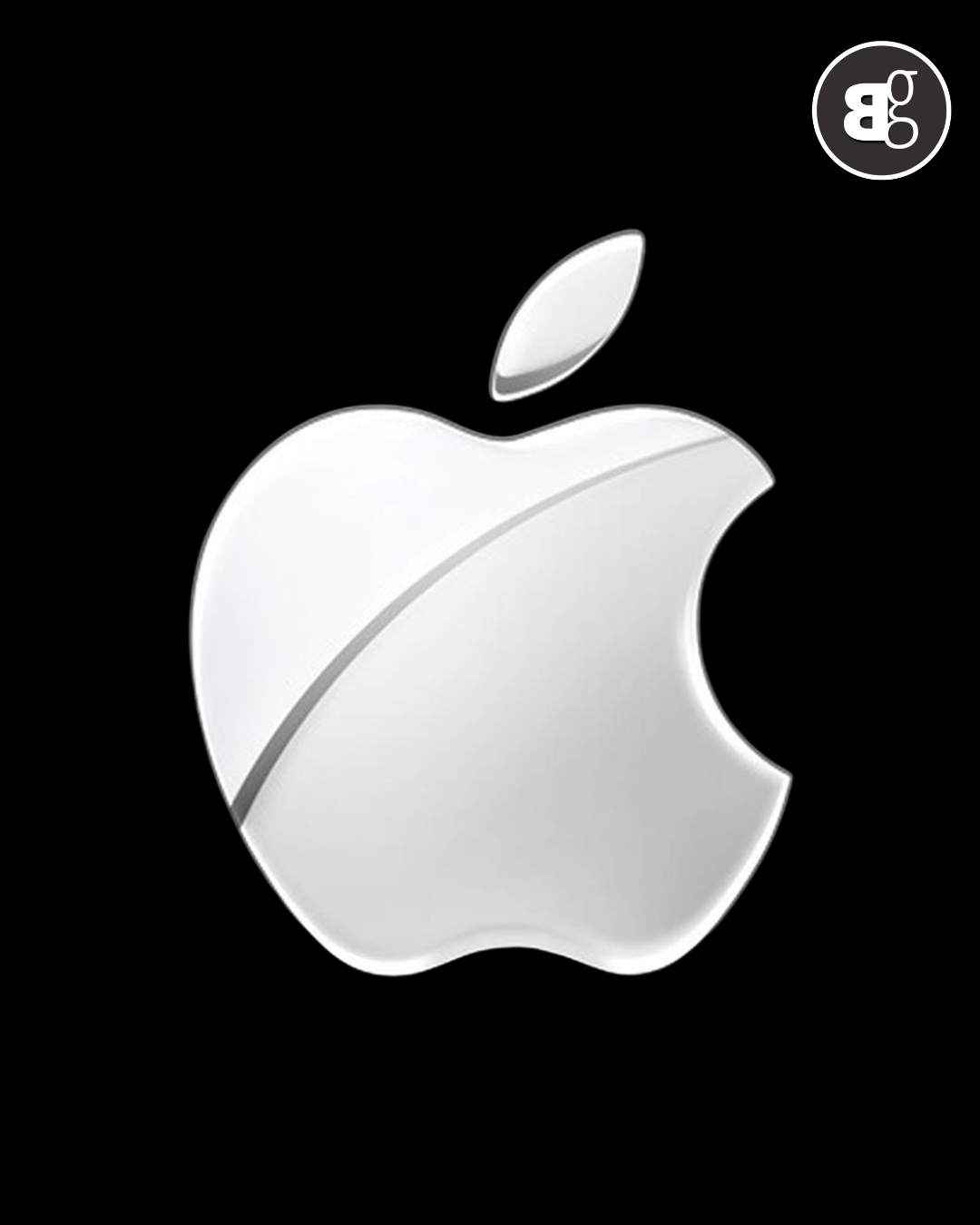
2007 was a turning point. Apple dropped the word “Computer” from its name and unveiled the iPhone. The logo was updated again, still sleek and shiny, but now it represented something bigger: Apple wasn’t just a computer company anymore it was setting the stage to reshape technology and lifestyle worldwide.
2017 Flat and Minimal
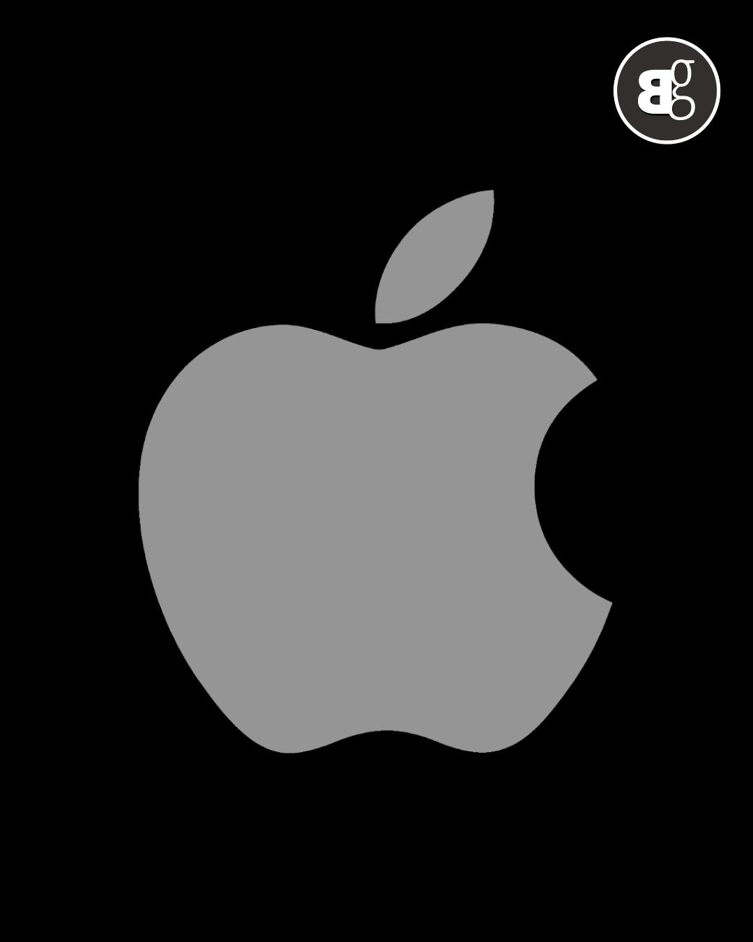
By 2017, Apple had grown into a global powerhouse. The logo shifted to a flat, minimal design clean black, white, or silver. No shine, no gradients. Just simplicity. And that’s the beauty of it: today, the bitten apple doesn’t need bells and whistles. It’s instantly recognized anywhere, whether on a phone, a billboard, or a laptop.
See More: The Apple Logo History
Some Apple Facts to Tickle Your Taste Buds
-
The bite in the apple isn’t about food it’s to make sure people don’t confuse it with a cherry.
-
The rainbow logo wasn’t just colorful it symbolized the Apple II’s ability to display colors, a big deal in the ’70s.
-
Steve Jobs believed that simplicity is the ultimate sophistication, which is why Apple logo became cleaner over time.
-
The logo itself has become a status symbol, often worn proudly on laptops in coffee shops worldwide.
Read More: Apple Might Be Building an AI Answer Engine for iPhone Users
How Apple Got its Name
Steve Jobs came up with the name “Apple” because it sounded friendly, approachable, and not intimidating like other tech companies of the time. He was also on a fruitarian diet back then, and he simply liked the name. More importantly, “Apple” would come ahead of rivals like Atari in the phone book yes, Alphabetical placement mattered in the 1970s!
Key Takeaways
-
Apple logo transformed from a detailed drawing to a simple, iconic bite.
-
Each version reflects Apple’s evolution as a company.
-
The current logo works because it embodies simplicity and elegance.
-
Fun facts about Apple show how branding and innovation go hand-in-hand.
-
Even the name “Apple” was chosen with simplicity and strategy in mind.
Conclusion
At the end of the day, Apple logo is more than just an image on a device. It’s a story of how the company grew, adapted, and kept reinventing itself. From a sketch of Newton to the simple bite we all recognize today, every version marks a moment in Apple’s journey. The current logo works because it’s clean, simple, and instantly trusted. It shows that sometimes, the simplest things can carry the most meaning.